In Between the Blank
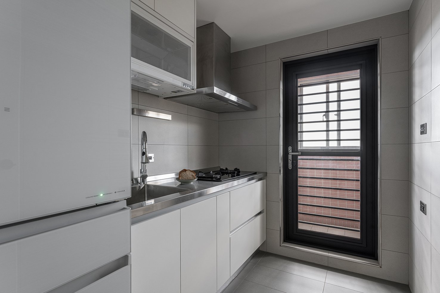
此案為25年老屋翻新案件,室內坪數約53㎡-16坪
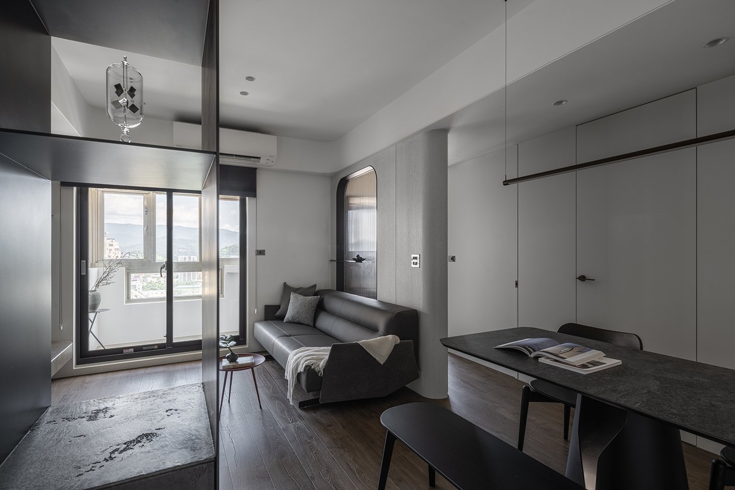
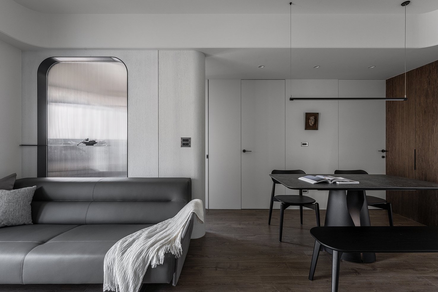
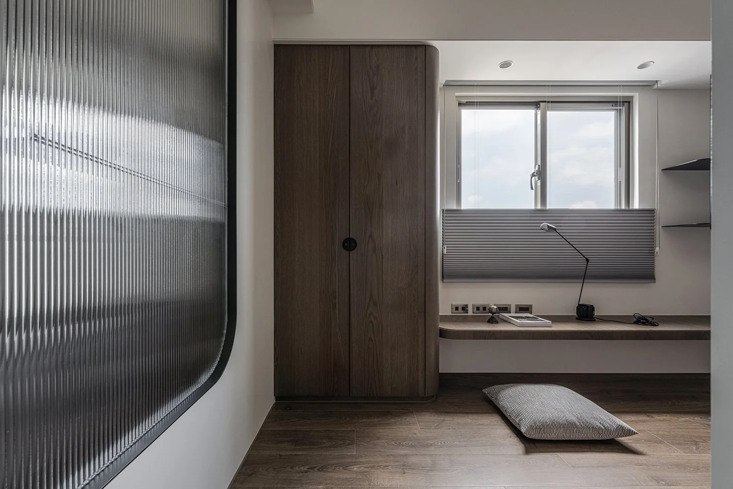
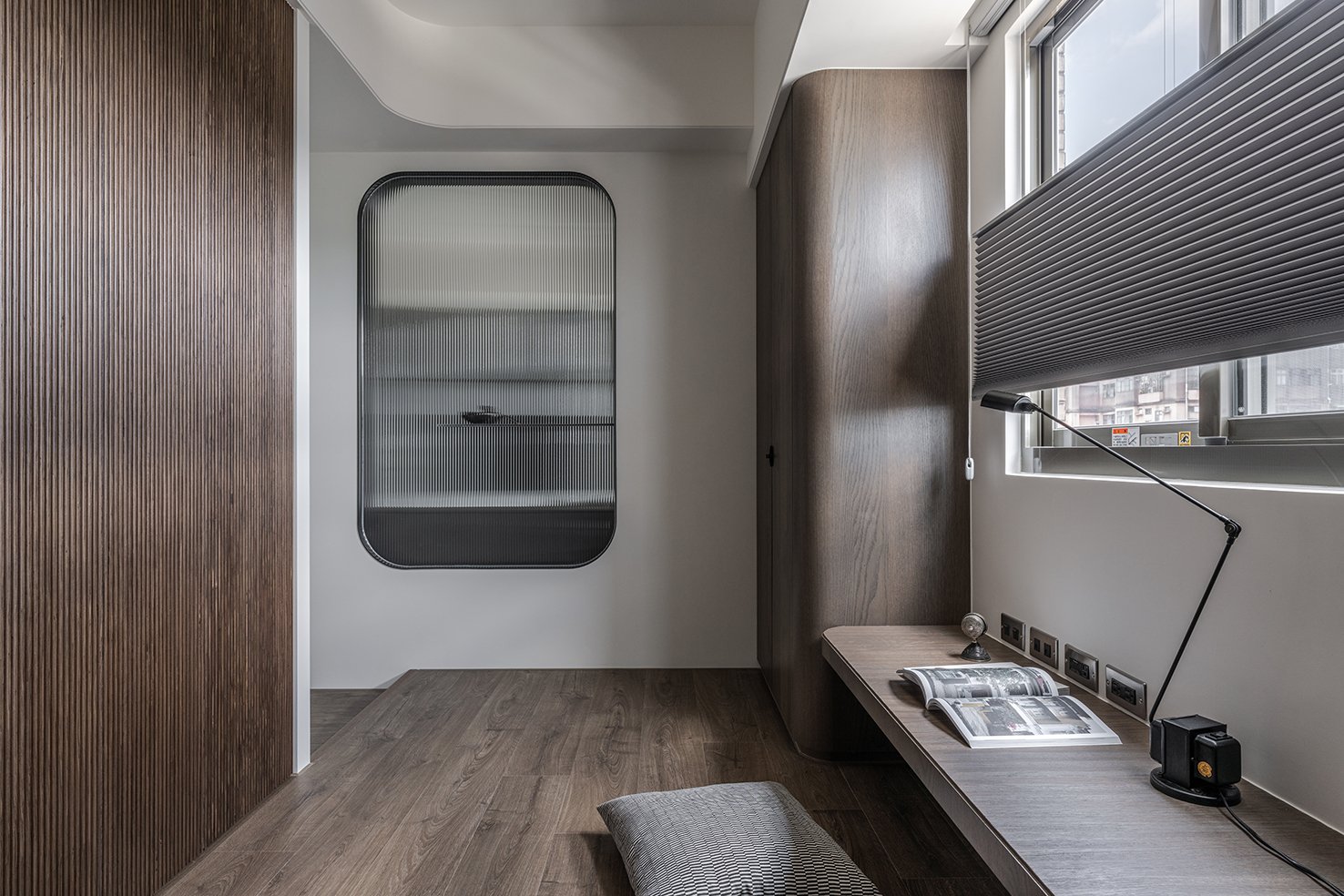
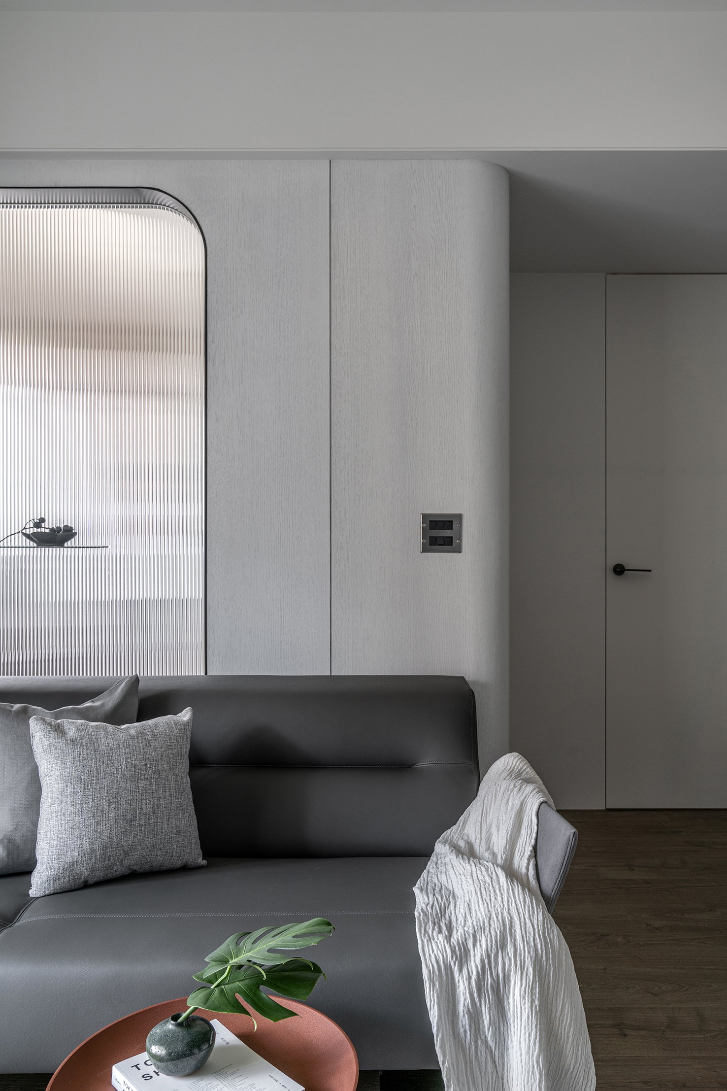
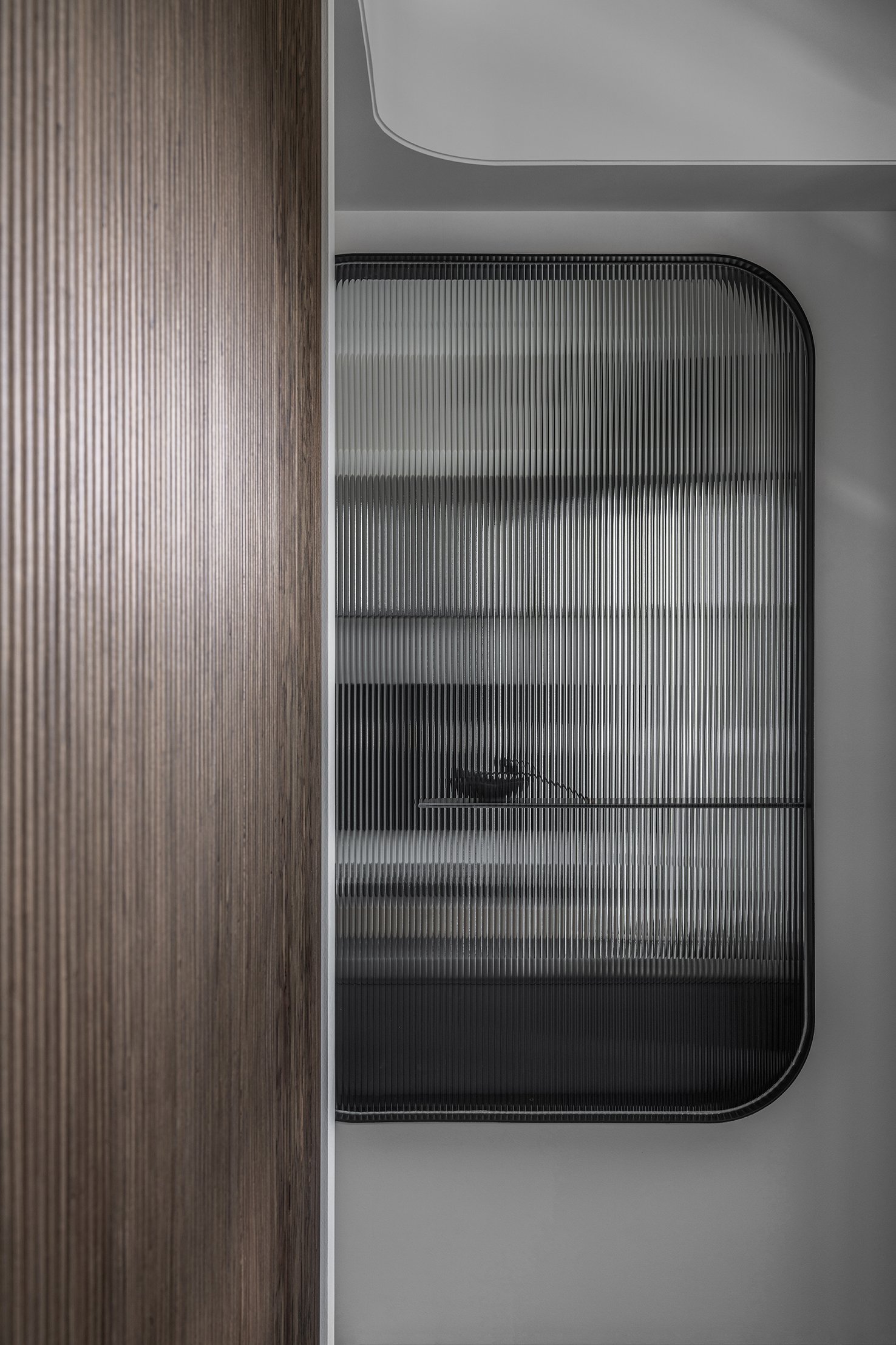
我們將局部隔間做微調,減少原有空間中的菱角,在書房(多功能室)牆面做穿透設計,使客廳區域的採光更加透亮舒適。
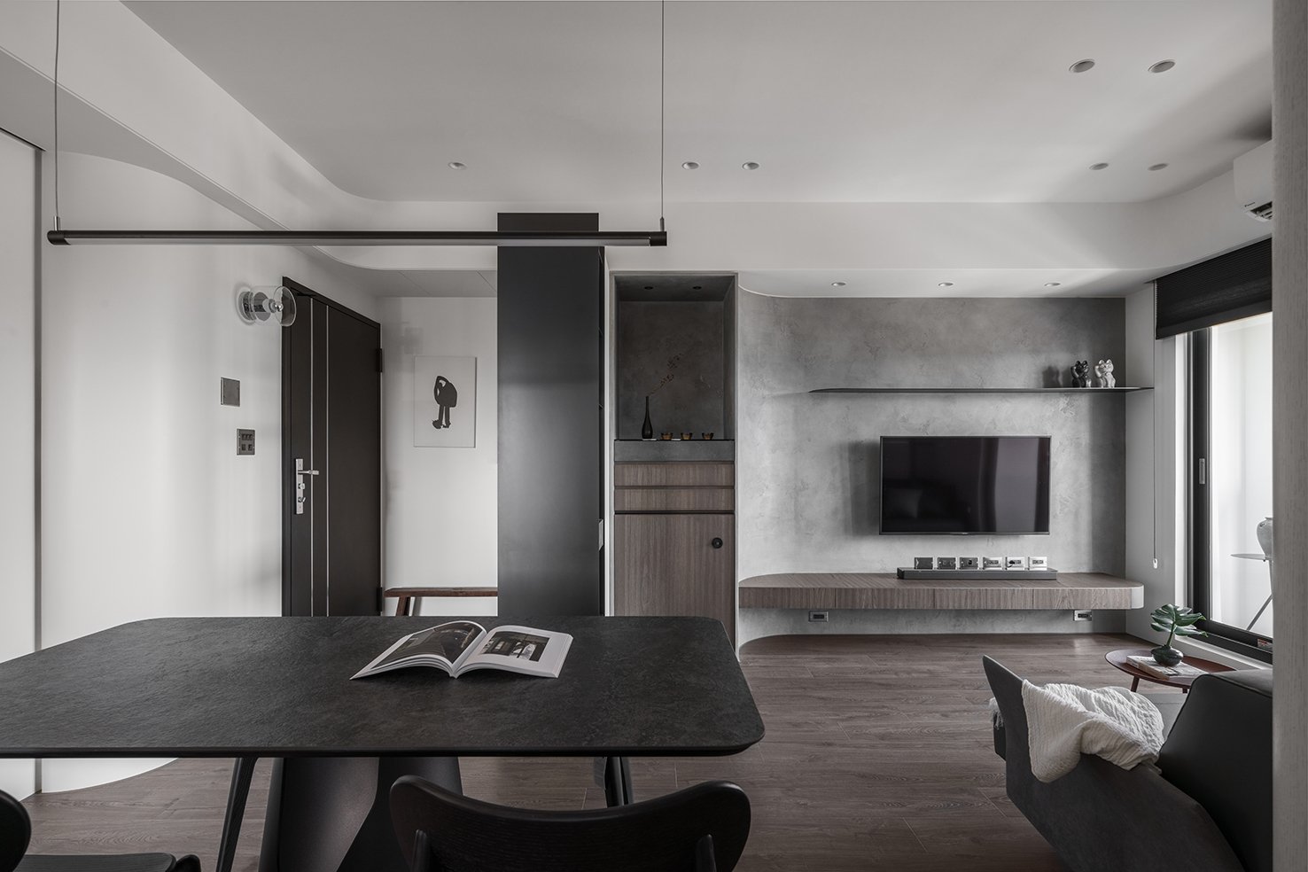
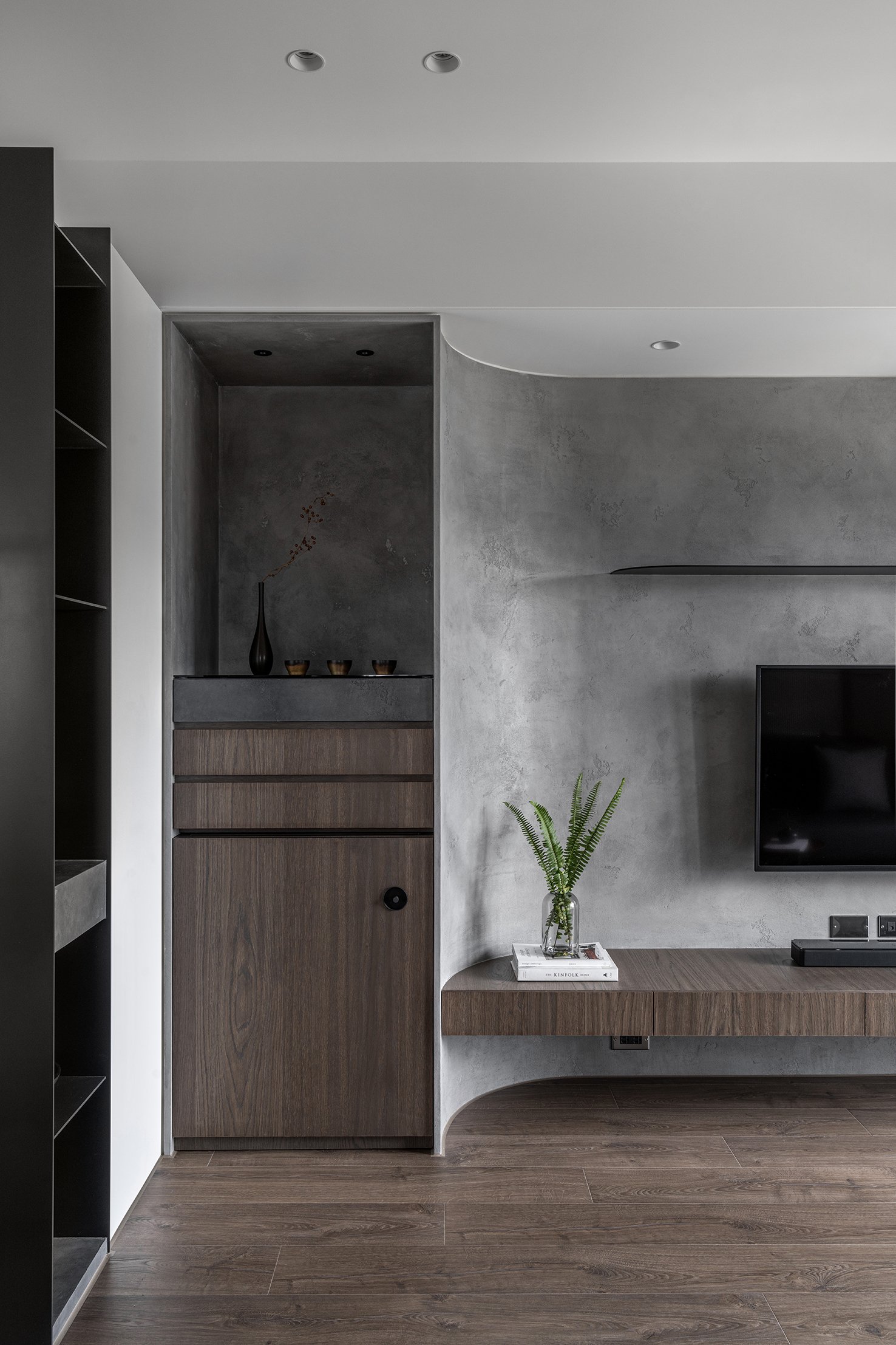
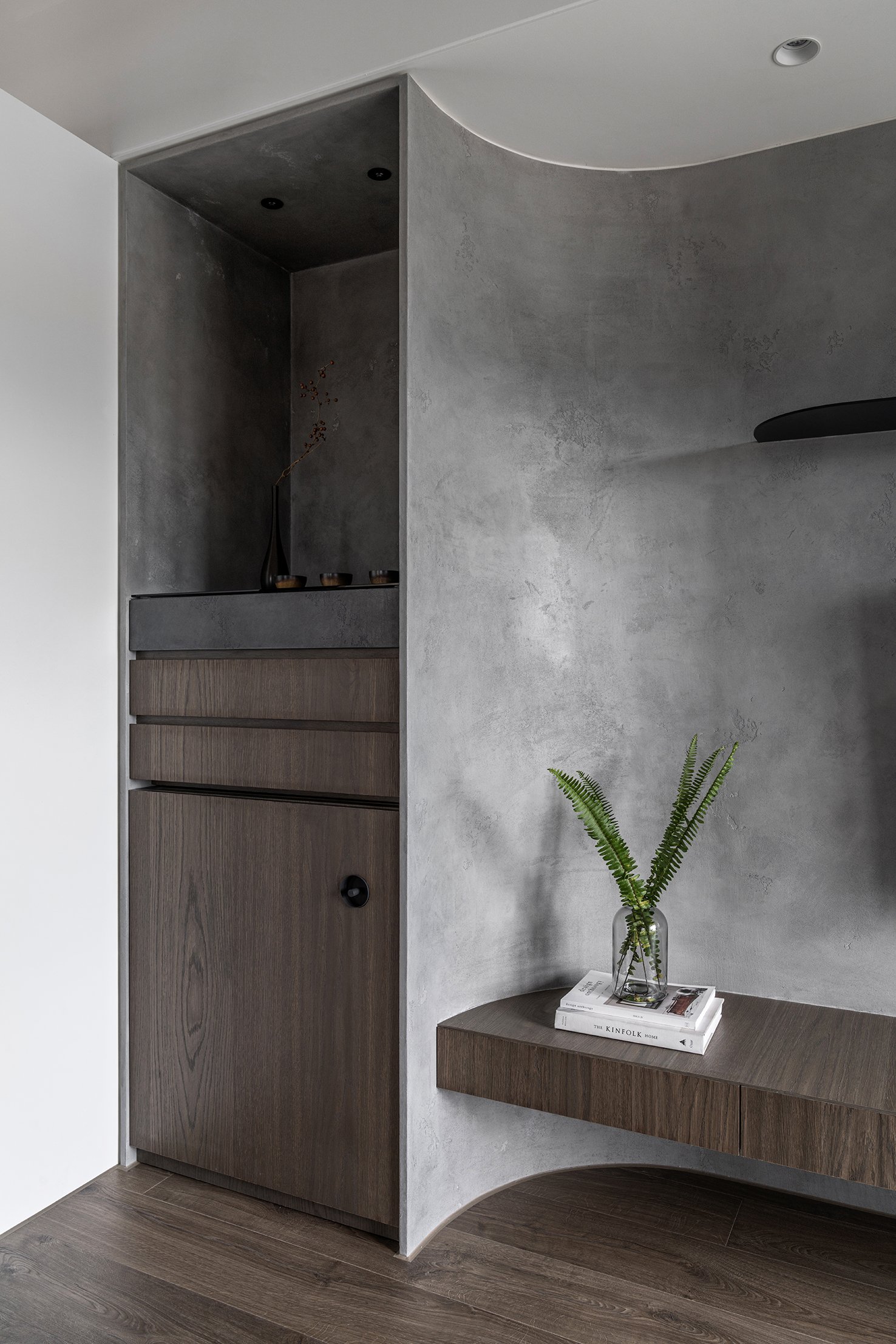
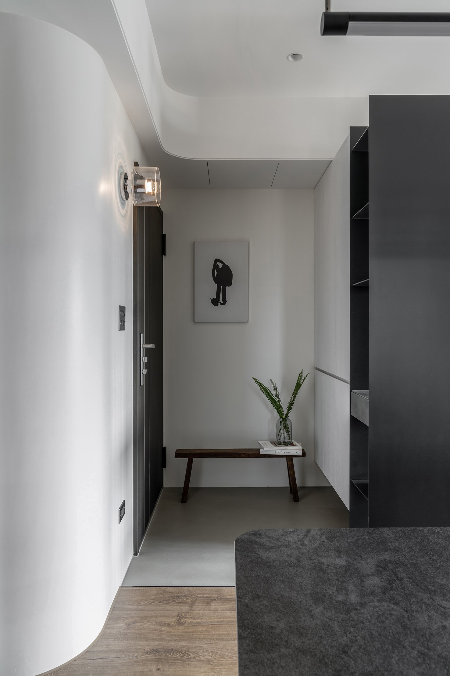
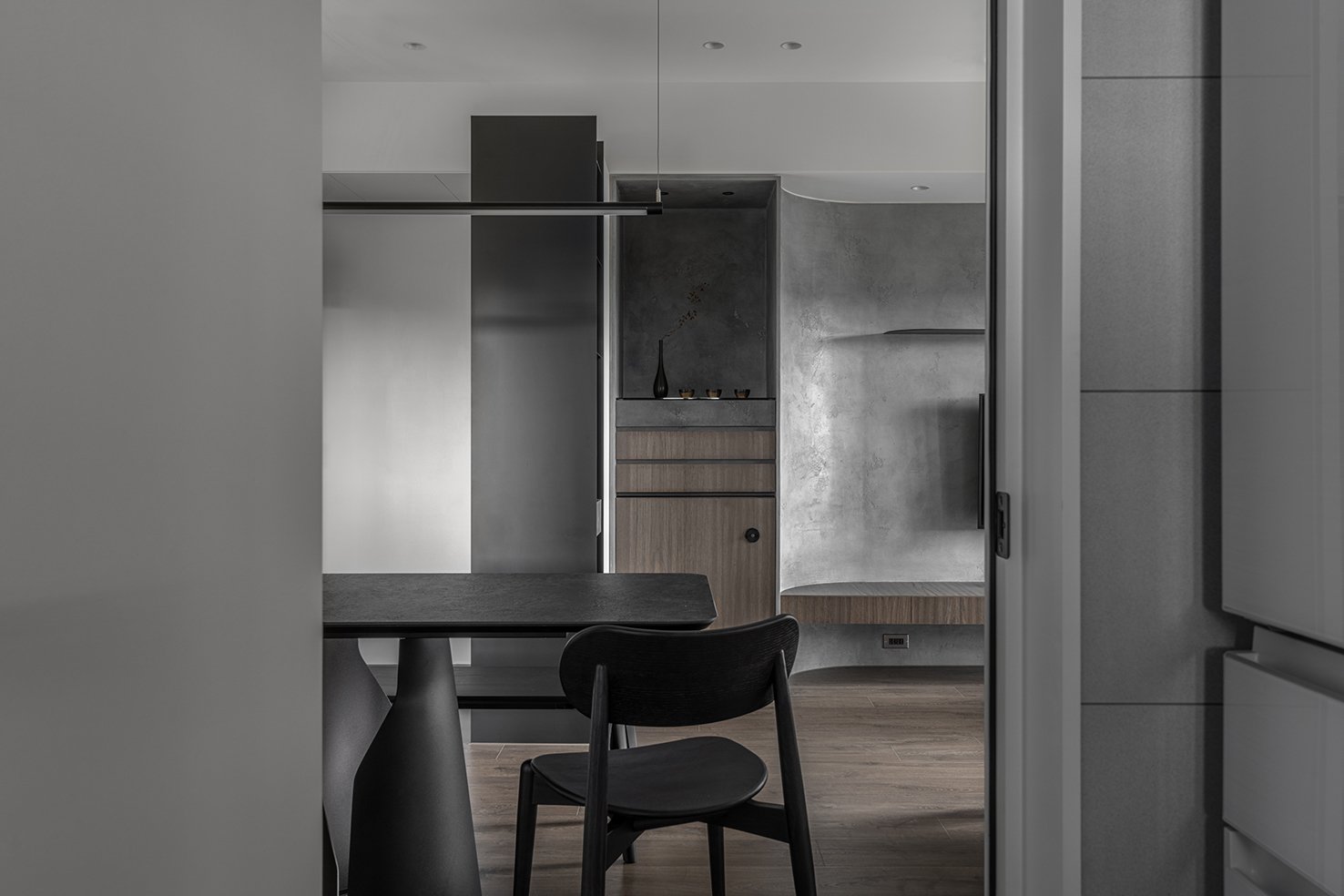
並加入了兩項業主需求 : 玄關與神桌,並配合風水考量將神桌完美地融入在電視牆設計之中。
風水與設計的整合
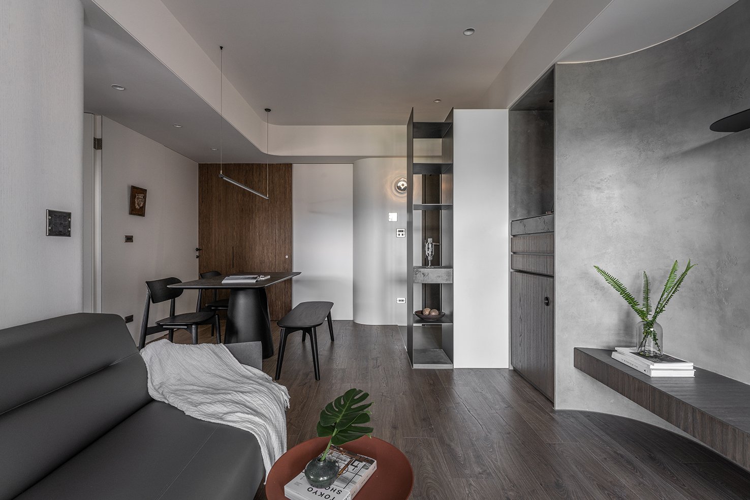
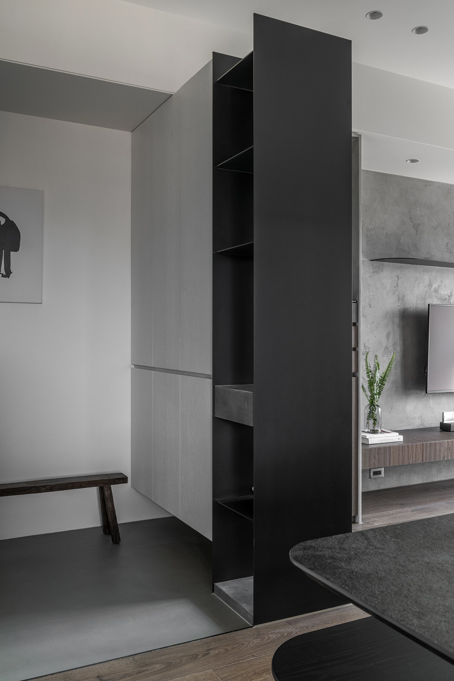
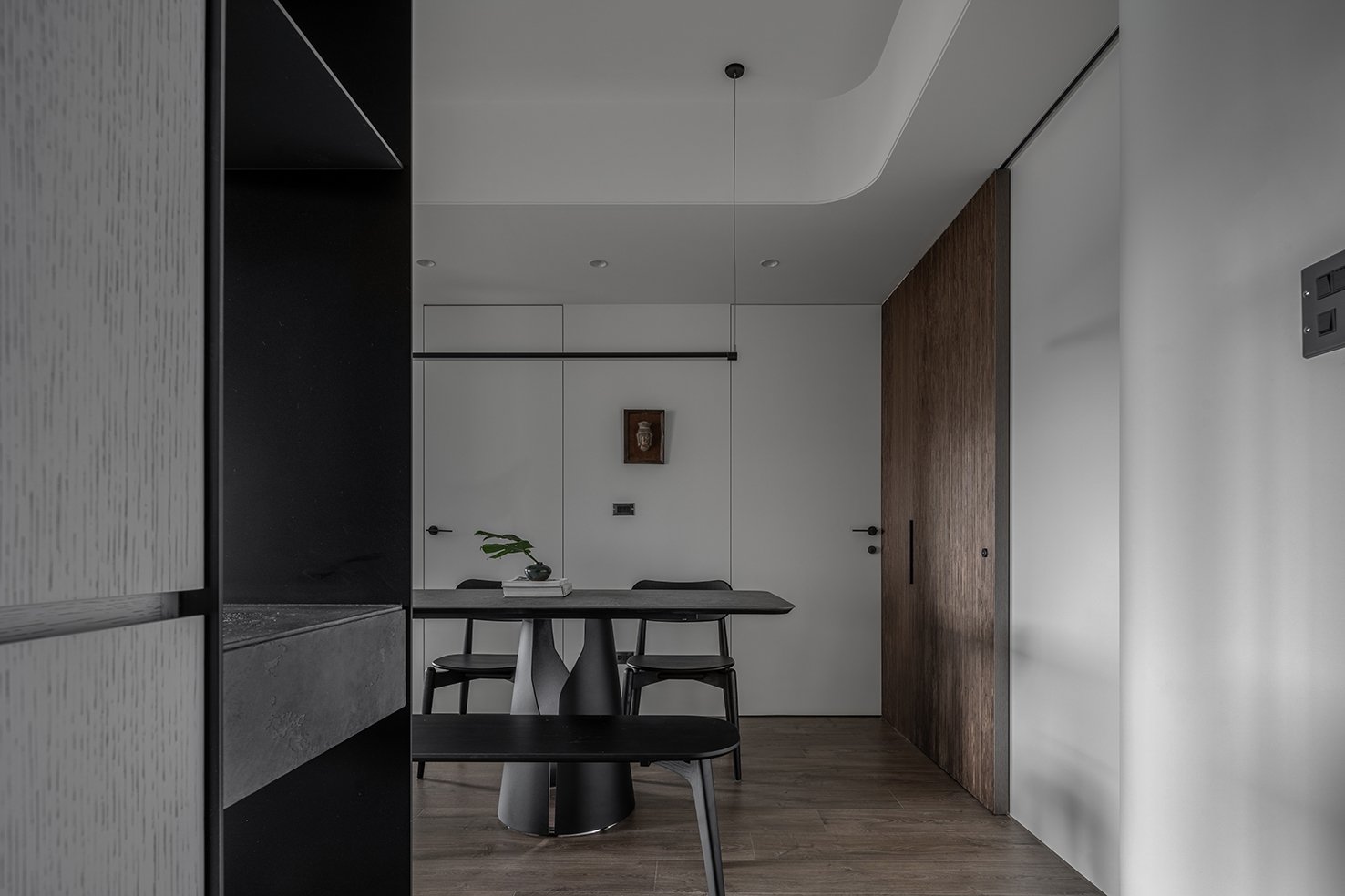
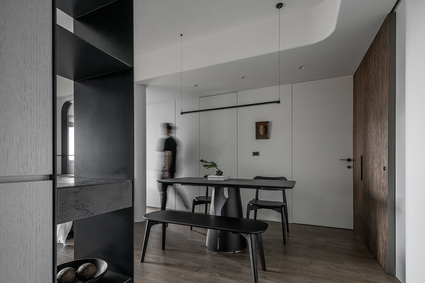
因應風水考量下,使用同材質並以曲面做結合,讓現今的使用者能與祖先皆能夠共享其中,玄關鞋櫃作為電視牆面的一個斷點,
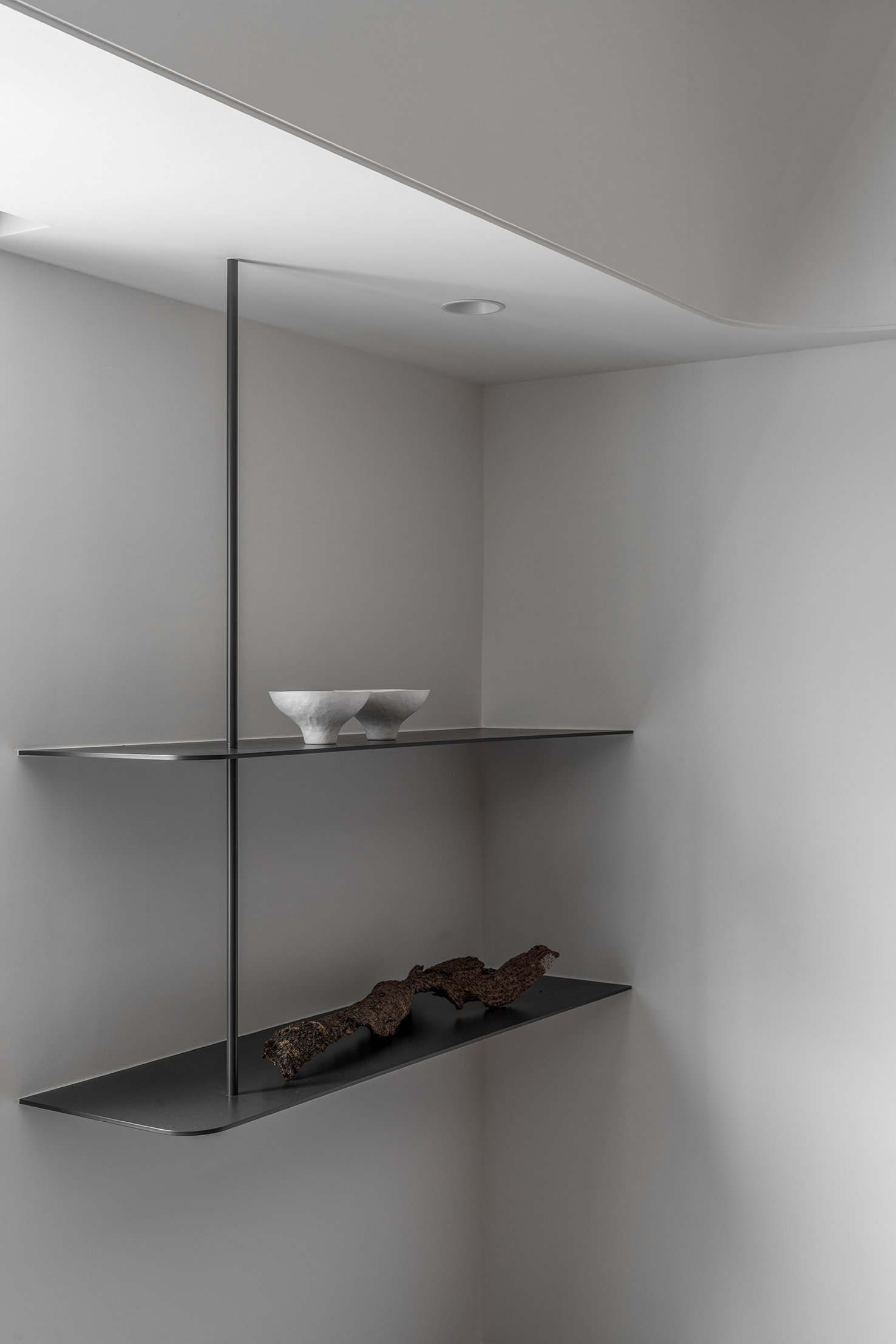
輕薄的鐵件減少進門壓迫感。
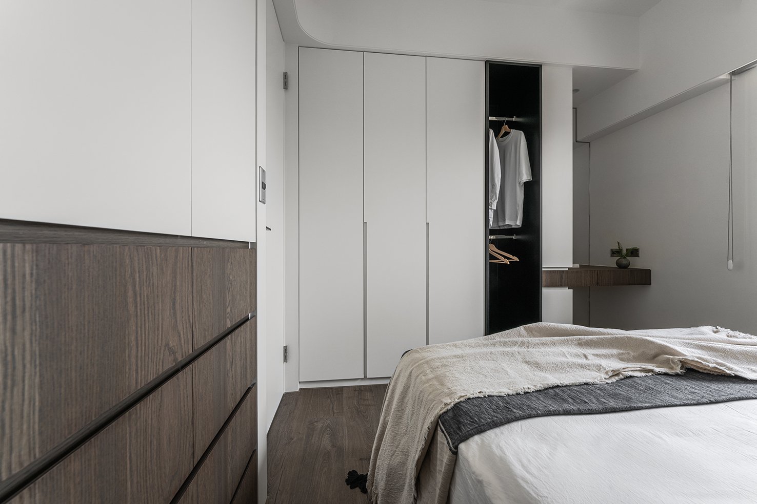
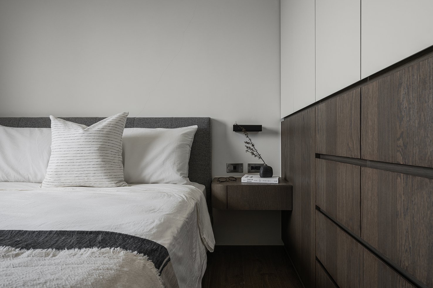
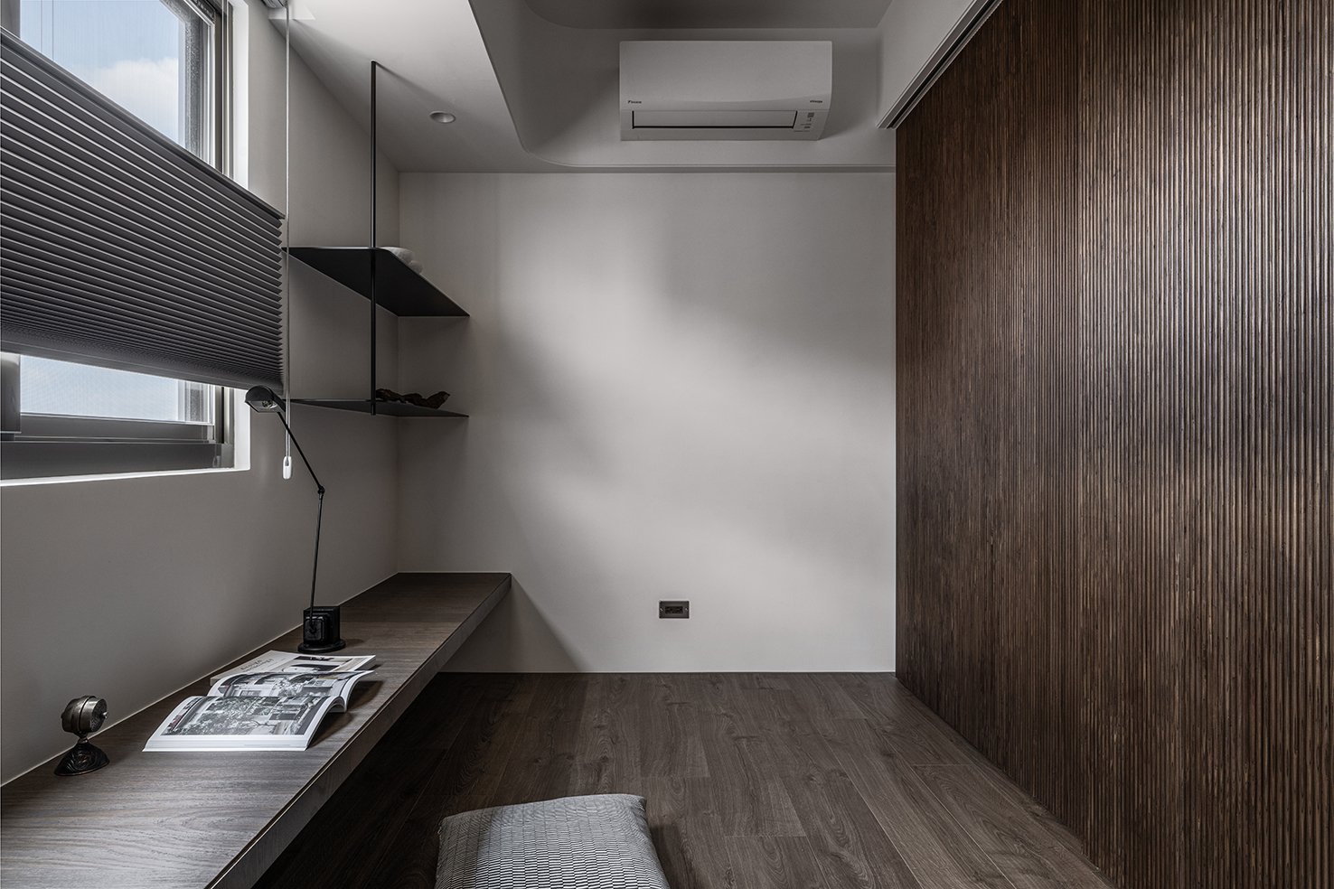
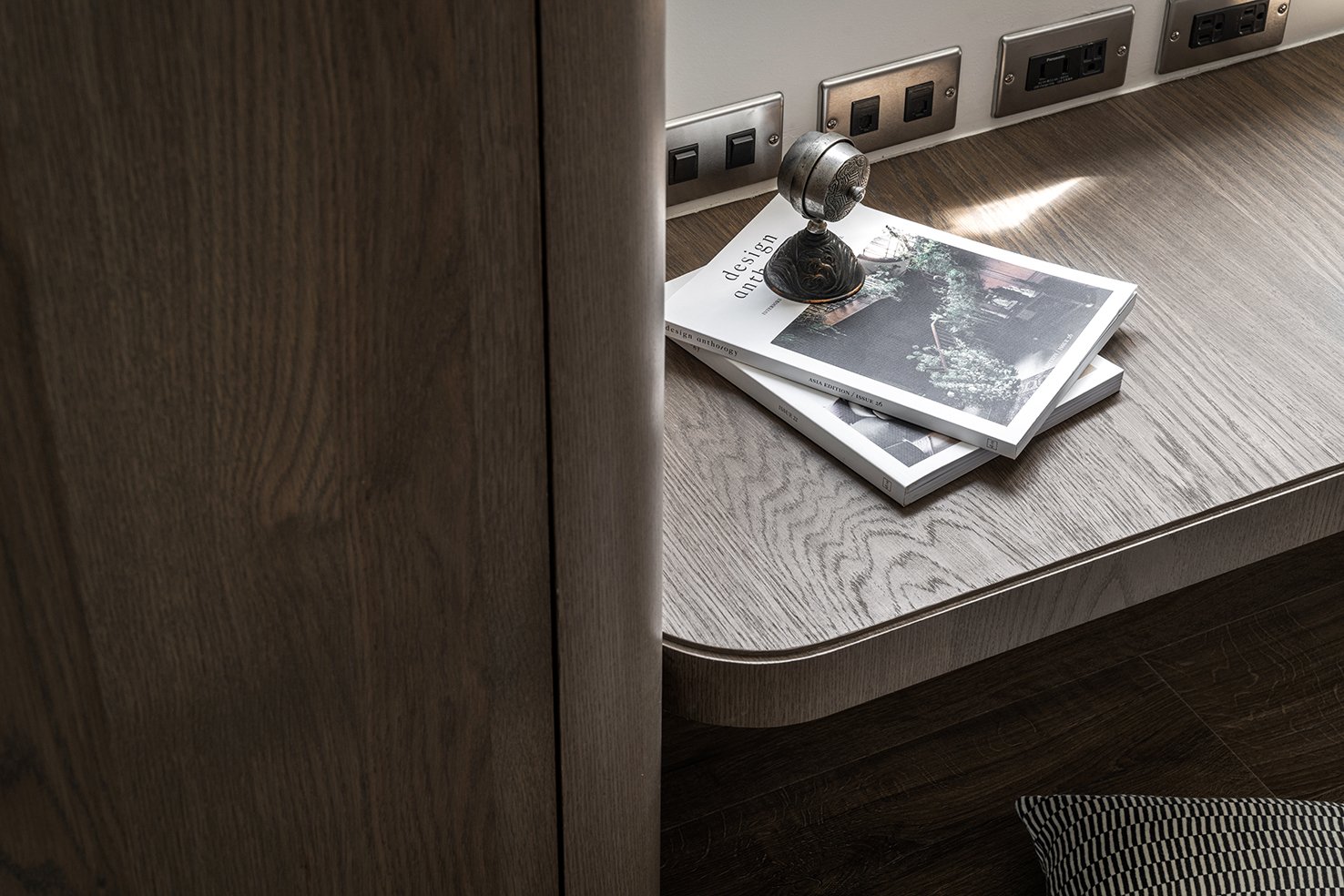
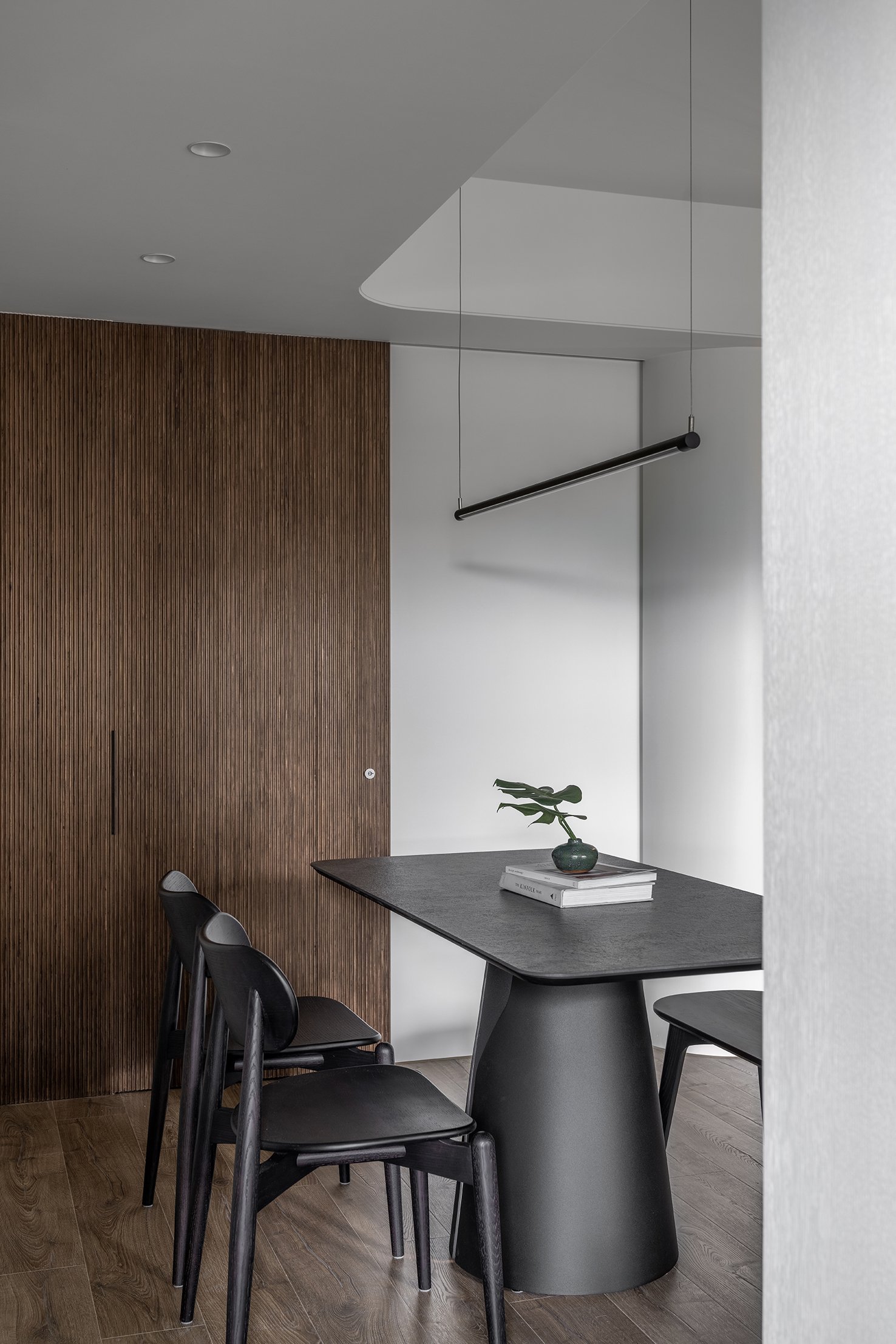
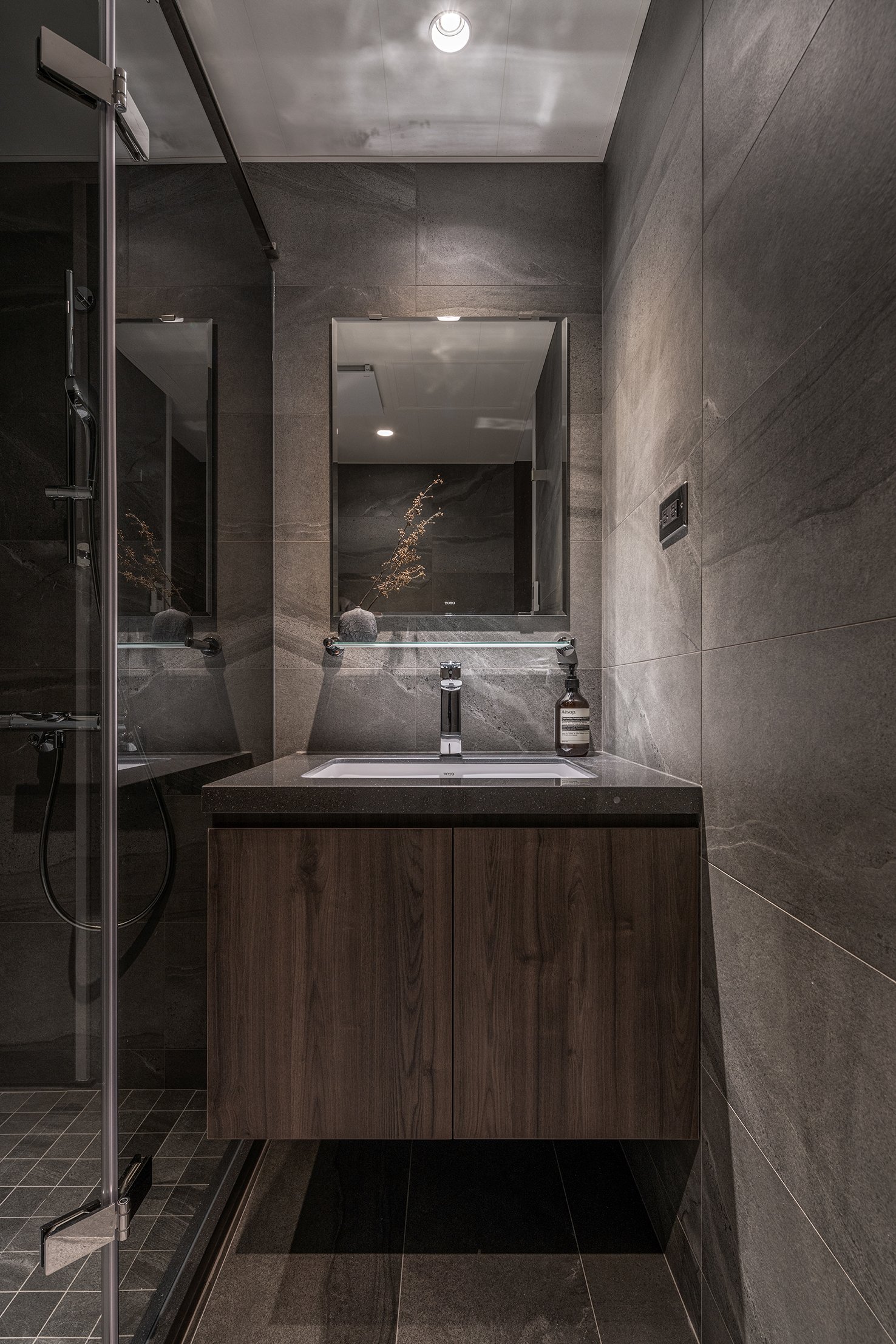
業主喜愛深色質樸的材質並有許多日式的收藏,所以我們設定上以材質本身紋理來表現質感,清水模、深色實木造型板搭配大面積的白,
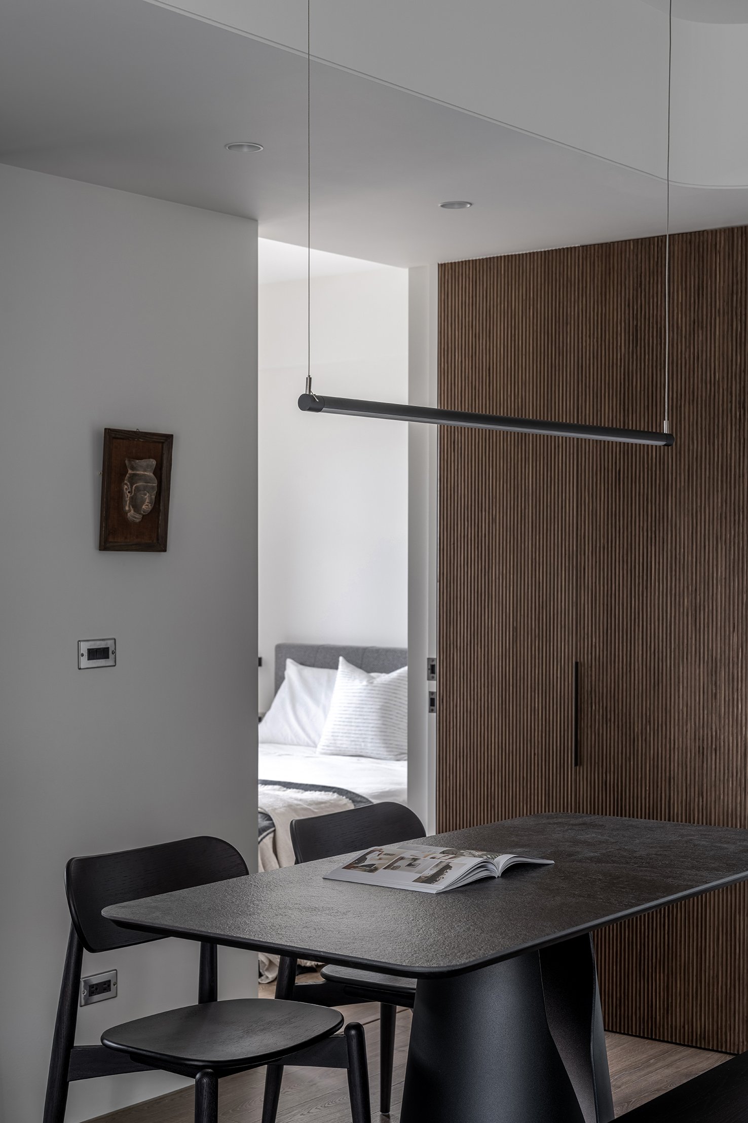
在廊道上的門框也刻意捨去呈現出簡單俐落的線條;業主也能夠將收藏展示並襯托在其中。
以極簡、細緻卻粗曠的質感呈現留白的價值,在白之間能夠看見更多的層次與變化,柔順的弧搭配俐落的線條是如此有力量的,
少即是多超越了形式,更多了生活哲學。
This project will refurbish a 25-year-old, 53-square-meter residential site for the best result.
Partition walls were revamped for a more streamlined, curvilinear silhouette throughout. The study room/multipurpose room wall was replaced with vertical-patterned glass, maximizing the living room area's airy, light vibe. The foyer and altar were added by request, with the latter concealed flawlessly in the hollow behind the TV wall curve.
Considering Feng Shui, the same materials were deliberately chosen and applied to form various curves. This design concept implies a fulfilled family reunion in this very space from ancestors to descendants. The shoe cabinet, accentuated with lightweight ironware to show welcome, also functions as a partition that separates the foyer from the living room.
To correspond to the owner’s preference toward authentic and dark shade elements, textures on the fair-faced concrete and dark woodboard are well-preserved and kept a huge part purposefully empty. The door frame on the corridor is thus removed to extend and highlight the sleek contour.
With layers and variations, the simplistic, delicate, yet rugged “blank” has so much more to tell. The elegant curvilinear outline transcends its essential form, expressing the concept of “less is more” and life philosophy through pure simplicity.
與白之間 新北C宅
