Coffee: Stand Up
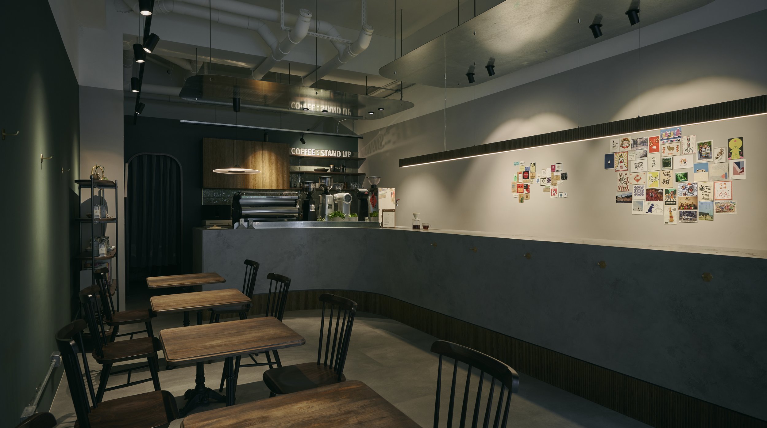
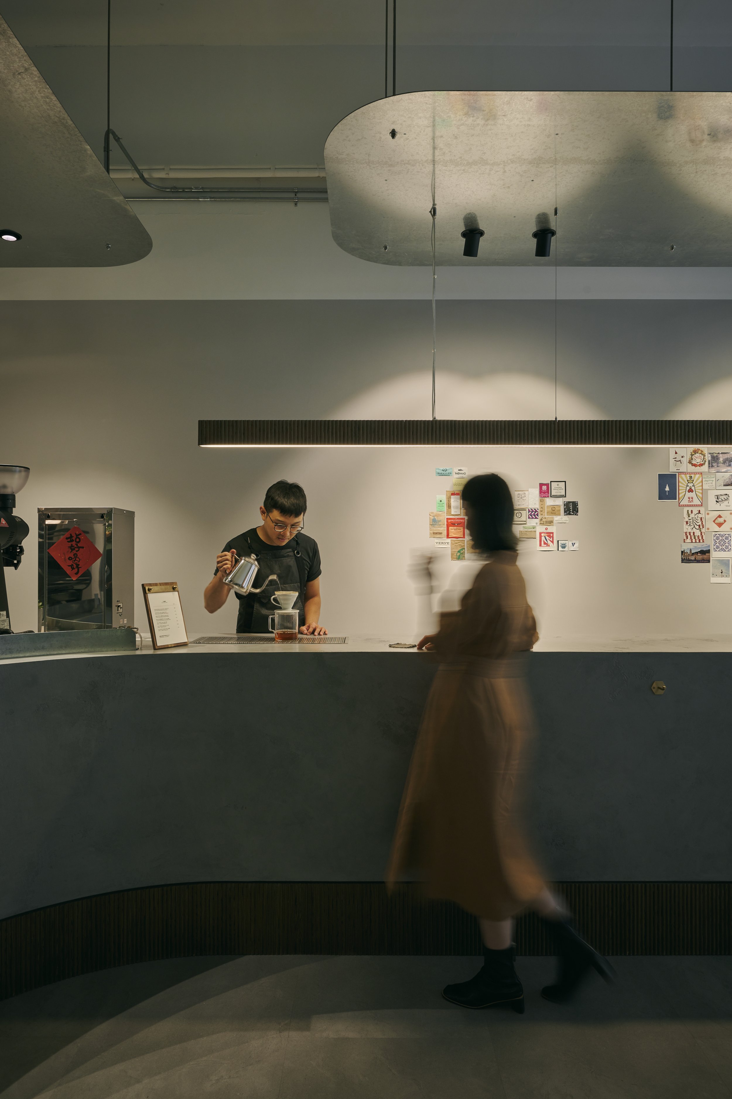
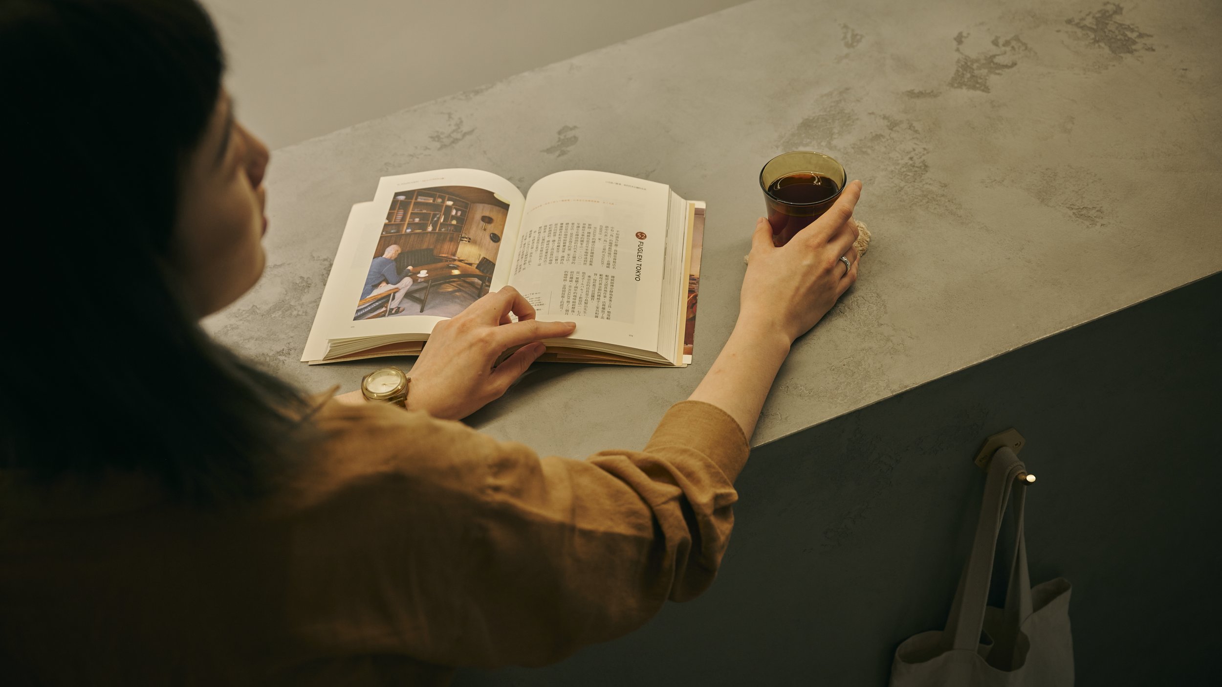
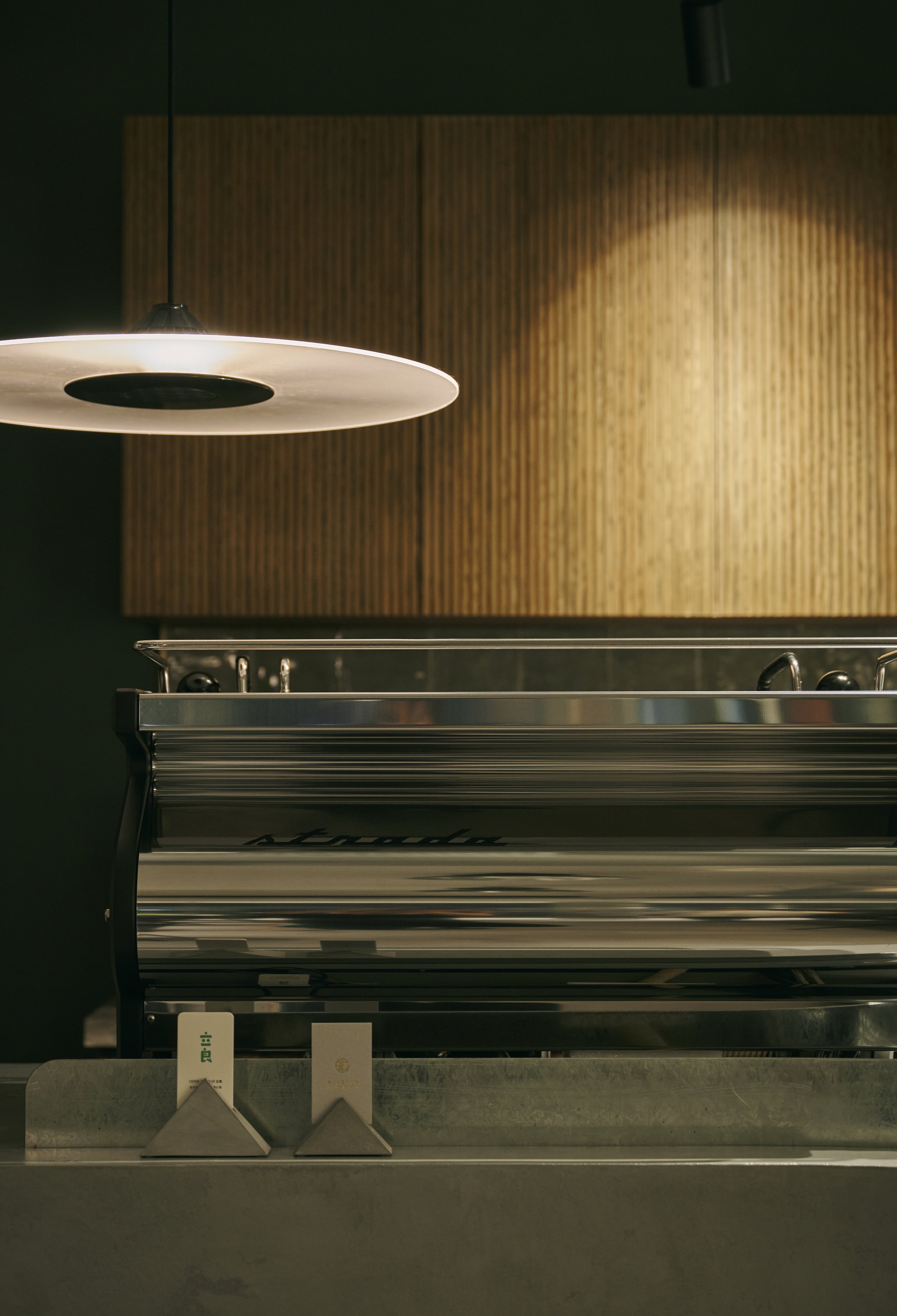
此案為15坪的商業空間,設計核心主軸圍繞在立飲的行為模式,吧檯區是進入空間的視覺焦點,希望在此經營者能與客人在此交流、分享並激盪出更多生活脈動,吧檯空間成為不可或缺的價值;設計為減法概念,穩固且富有力量座落在此,大彎曲面的延伸,柔和調和其中,基部使用細緻實木線板,呈現有溫度的極簡細緻感。
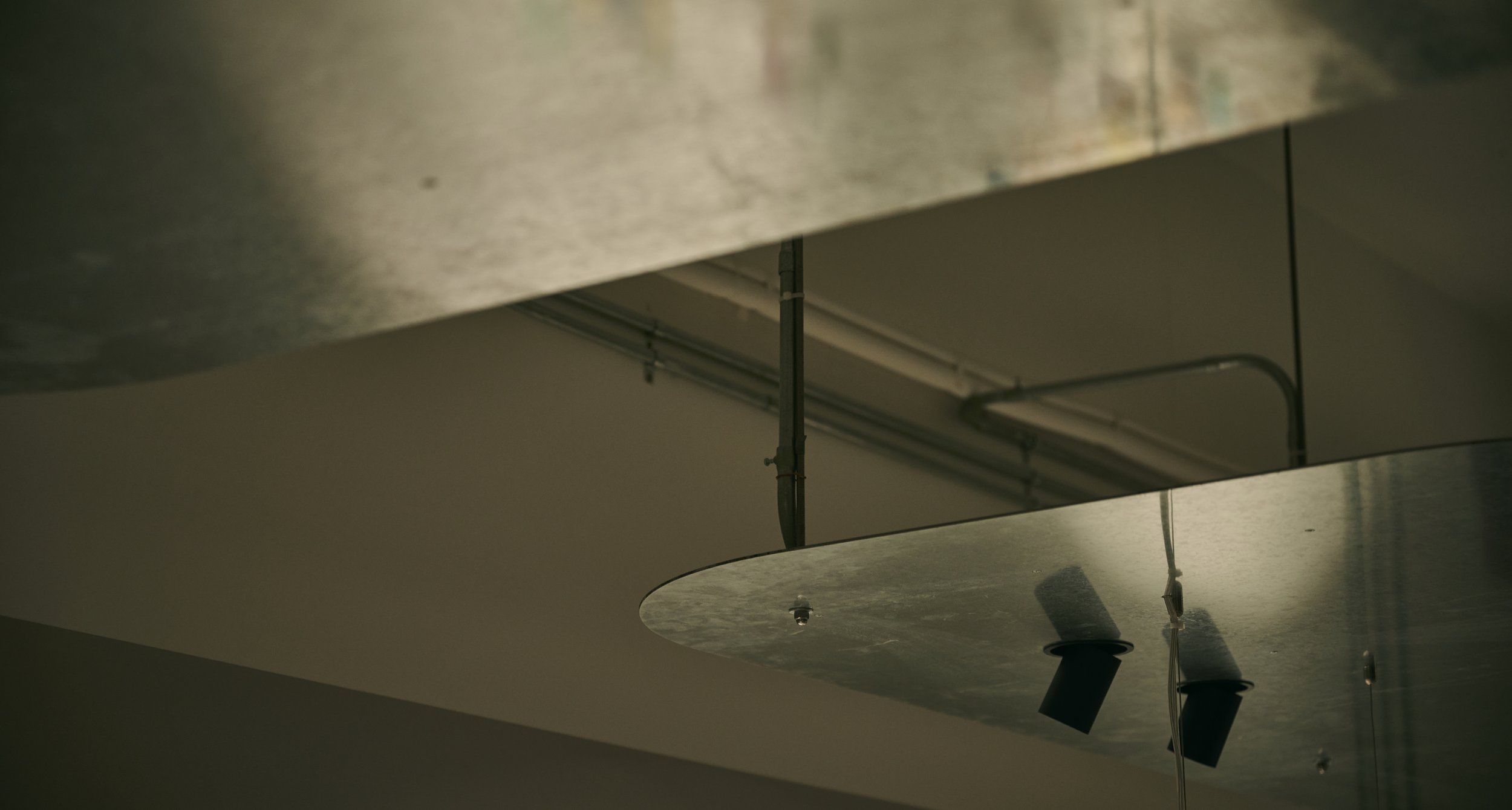
空間中只使用兩片輕薄的鍍鋅鋼板作為唯一的天花造型,巨幅的亮面鋼板懸浮在重點區域,除了能增添採光,也表現俐落的都會元素;並收齊所有天花的配管,讓上方區域保留乾淨挑高的尺度。
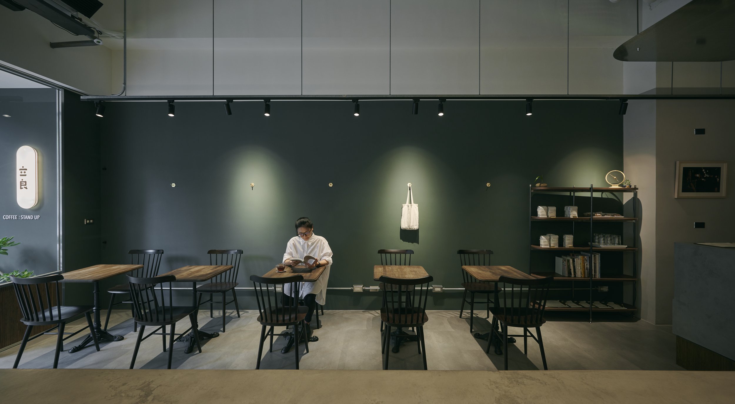
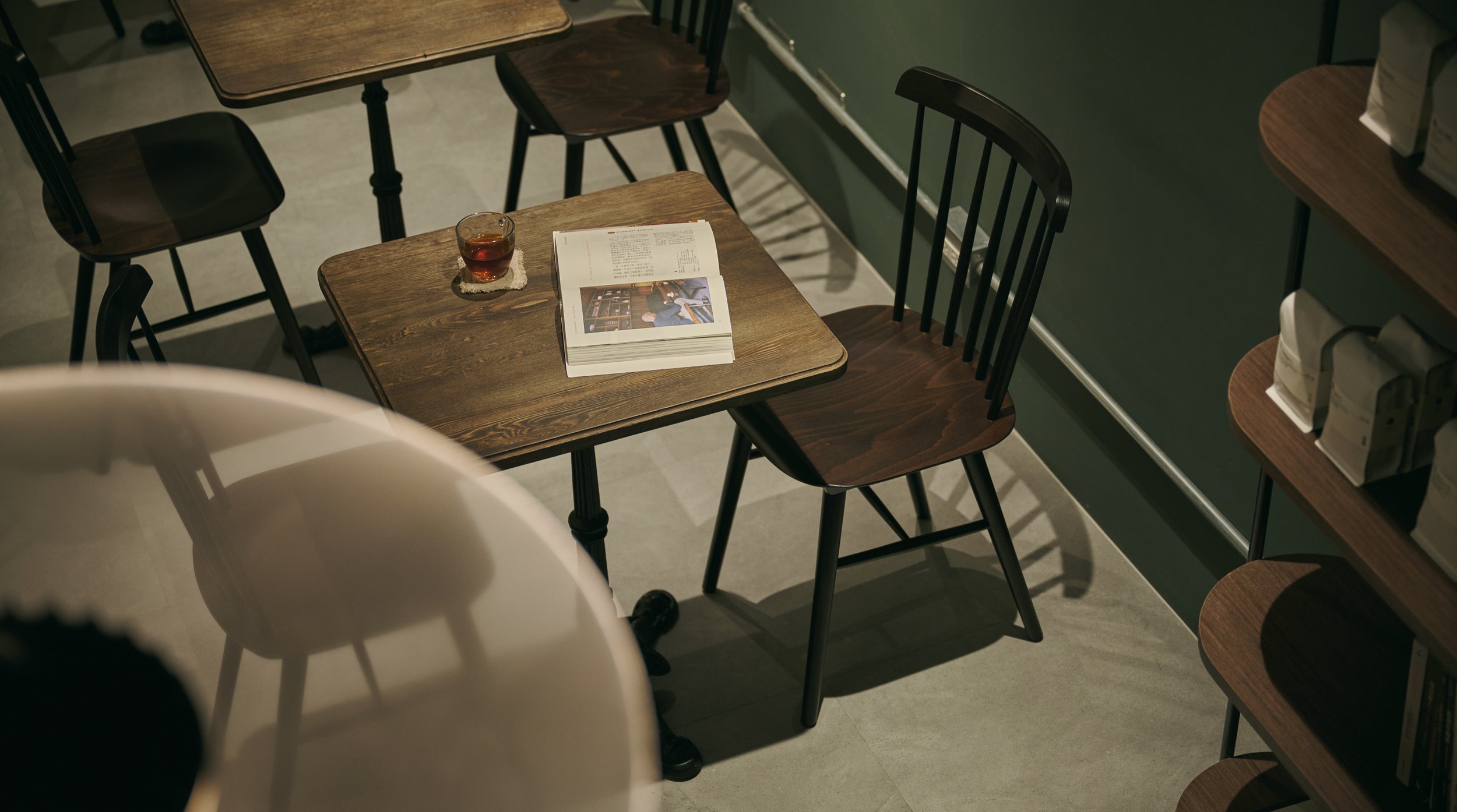
材質上選用反射、亮面現代的材質搭配代表咖啡自然紋理的溫暖,色彩為墨綠、輕土壤的大地色彩,一輕一重的讓空間表現得更為精神。
強烈且溫柔的方式呈現質感與流暢平衡,讓人在此喝完咖啡,完美地展開一日生活起點。
What should a coffeehouse be like in this fast-paced, ever-changing era? What changes must be made to adapt and overcome contemporary challenges? This question is paramount to me as a standing coffee bar pioneer entrenched in Taipei.
The answer thus forms the philosophy that pervades the design throughout. In about 50 square meters of space, this modern coffee bar highlights the behavior of stand-up drinking. Once entered, the visual focus falls naturally on the curvilinear counter, where people share thoughts and get inspired. The sturdy, hefty, marble-pattern countertop is paired with a refined wood stripe base, giving an elegant sense of simplicity and warmth.
Two zinc-plated, polished sheets floating midair are the sole décor up above, introducing urban chic style to the interior. The two thin metals also brighten space through reflection and keep the ceiling neat by hiding the cables and pipelines.
Shining, light-reflecting modern materials are arranged to contrast with natural textures. Responding to that, the color palette of viridian green and earthy light brown introduces a softer element, rejuvenating the bar in this fashion.
Robust but tender, a harmonic balance with affection and smoothness. There is no better place to kick start a perfect day.
立良


